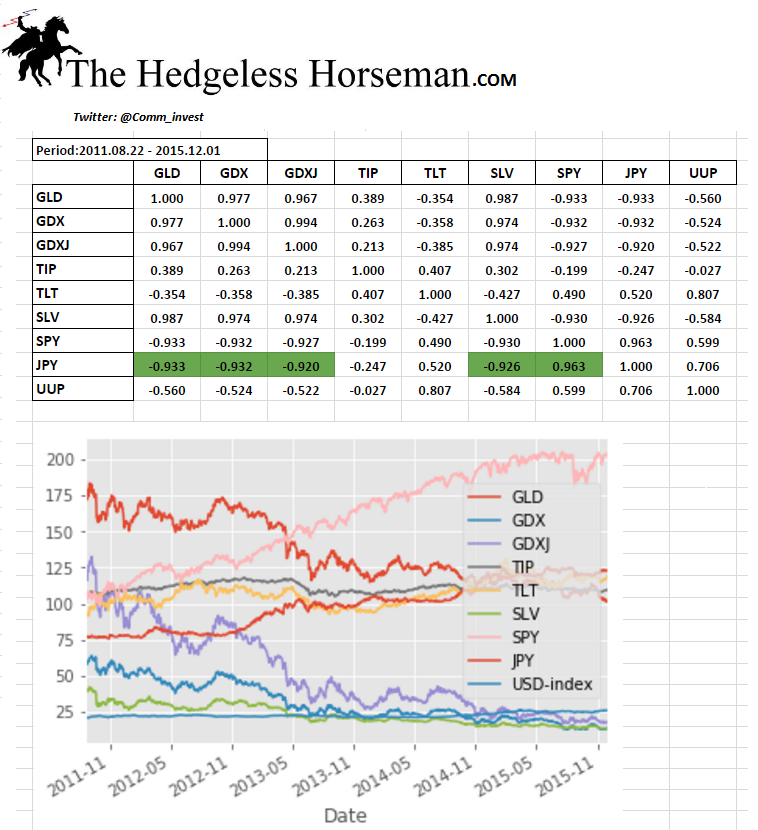
Correlation Table: The Results May (Should) Shock You
I was interested to see what the correlation was between different assets and asset classes during the period from when gold topped 2011, to when it bottomed 2015. I just had to include the Yen (USD/JPY) since more and more people are noticing its seemingly strong relationship with gold, silver and the S&P500 index.
Anyway, here were the results:
I ran correlations over two other periods as well (2010-2017 & 2015-today), which gave similar results overall. However, JPY and it’s correlation with TLT as well as SPY changed dramatically. I will be putting up additional charts soon.
Some notes regarding the correlations
- JPY seems to be the linchpin for the precious metals as well as the SPY (although correlation does not guarantee causation).
- Gold (paper) was the most sensitive asset class in regards to changes in real yields.
- Gold, silver and miners was the anti trade of S&P500 (exactly what the “people up stairs” would want).
- This is not a functioning free market anymore. Especially JPY’s correlation data is beyond ridiculous.


That’s just the carry trade at work no? Borrow cheaply and invest elsewhere. Works great as long as the Yen stays weak, not so well if the Yen strengthens.
Yes, I would say so. The liquidity provided from the Yen carry trade and/or HFT programs seem to be the the single biggest price driver at least on the margin.